
Winter · dominant trait: Clarity
Clear Winter Color Palette: Hex Codes, What to Wear and What to Avoid
Clear Winter is the Winter sub-season whose dominant trait is clarity — cool in undertone, deep in value, clear in chroma. This page lists the full twelve-color Clear Winter palette with hex codes, the 3 neutrals to build a wardrobe on, four colors to avoid with a substitute for each, and how to tell Clear Winter apart from Clear Spring.
- Undertone
- Cool
- Value
- Deep
- Chroma
- Clear
- Also called
- Bright Winter, Clear Cool Winter
Understanding the Clear Winter color palette
What Clear Winter looks and feels like
Clear Winter carries the highest contrast of all twelve seasons — Black and Bright White as true anchors, with one jewel tone doing the rest of the work: Cobalt, Emerald, True Red. Lemon Yellow and Bright Turquoise sit at the same intensity as the rest of the palette rather than reading as accent pastels, which makes them louder in an outfit than their names suggest.
Building a Clear Winter wardrobe
Build outfits from a Black-and-Bright-White base with exactly one strong accent color — True Red or Cobalt against black reads as this season's signature combination. Lemon Yellow and Bright Turquoise work better as smaller accent pieces — a bag, a shoe — than as a full outfit, since even at accessory scale they carry real intensity. Platinum or white-gold jewelry.
Common Clear Winter styling mistakes
Earthy “universal neutral” advice — warm beige, olive, rust — is marketed as flattering on everyone, and it is the opposite of flattering here: those tones mute exactly the contrast that makes this coloring work. If warmth is wanted in a look, a saturated warm accent like Lemon Yellow does it without dulling the palette the way an earthy neutral would.
The Clear Winter palette — 12 hex codes
You carry the highest contrast of the twelve seasons — dark hair against lighter skin, bright striking eyes. Clarity leads: your palette is pure, saturated color with black and white as anchors, and muted shades read as dull on you.
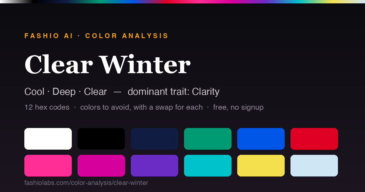
Build on the neutrals. Bright White (#FFFFFF), Black (#000000), Navy (#101C42) are the base — coats, trousers, bags, shoes. The remaining colors go closest to the face, where they do the most work.
Colors to avoid as a Clear Winter — and what to wear instead
None of these are bad colors. They are the shades that compete with your clarity and pull attention off your face. Each swap keeps the same role in an outfit while staying inside the palette.
| Avoid | Hex | Wear instead | Hex |
|---|---|---|---|
| Warm Beige | #BFA078 | Bright White | #FFFFFF |
| Olive | #7A7E4A | Emerald | #009B72 |
| Rust | #A94724 | True Red | #E00024 |
| Dusty Rose | #C894A0 | Hot Pink | #FF2D95 |
Makeup: Clear cool-pink blush, true red or bright fuchsia lip, defined dark eye.
Building outfits in your palette
The palette tells you which colors; these two rules, both drawn from the same hue and chroma that define Clear Winter, tell you how to combine them.
Metals: silver, platinum, and white gold
Silver, platinum, and white gold suit you best — cool metals echo your undertone; gold can look yellow or heavy against it. This is the same undertone logic as the jewelry test above; it applies to belt buckles, watch cases, glasses frames, and hardware on bags just as much as to jewelry itself.
Build outfits with contrast
Your coloring reads naturally high-contrast, so outfits that pair a light piece with a deeper one — or a saturated color against a neutral — look intentional rather than muddy. A head-to-toe tonal outfit, all mid-value and blended, tends to look flatter on you than it would on a Soft season.
How to confirm you are a Clear Winter
Do these in daylight, on bare skin, with no makeup and no dyed hair in the frame. If any of them contradicts your result, you are probably on a border — check the neighbouring seasons below.
- Vein test — in daylight, your wrist veins read blue or purple rather than green.
- Jewelry test — silver sits better against your bare skin than gold; gold can look yellow or sallow on you.
- White paper test — held next to bright white paper, your skin reads pink, rosy, or slightly blue.
- Value check — your overall coloring sits in the bottom half of the value scale. Your natural hair is dark, and pale pastels next to your face wash out before you do.
- Chroma check — look closely at your iris in daylight. If the pattern is crisp and clearly delineated, your coloring is clear, and muted, dusty shades will flatten you.
The one comparison that settles it: Clear Winter vs Clear Spring
Both lead with the same dominant trait, so they read alike in photographs. The undertone is opposite — Clear Winter is cool, Clear Spring is warm. Hold Black (#000000) against your bare face, then Bright Coral (#FF5A5F). The one that makes your skin look clearer rather than sallow or gray is your side of the line.
See the Clear Spring paletteIf Clear Winter does not look right
These are the three seasons a Clear Winter result is most often actually. The two other Winter sub-seasons share your undertone and differ on which trait leads; Clear Spring shares your dominant trait and differs on undertone.
Deep Winter
Cool · Deep · Clear
Leads with depth.
View paletteCool Winter
Cool · Deep · Clear
Leads with coolness.
View paletteClear Spring
Warm · Medium · Clear
Leads with clarity.
View paletteNot sure this is your season?
Answer eleven questions about your skin, hair, and eyes and get your season, your palette, and your closest alternative. Free, no signup, nothing uploaded.
Take the free color analysisWhere this palette comes from
There is no canonical public hex set for the twelve seasons — the definitive swatch books belong to proprietary systems (Sci\ART, House of Color, 12 Blueprints) and are not published as hex values. This is our reference palette for Clear Winter: built to the season's documented hue / value / chroma envelope and cross-checked against published seasonal palettes. It is not, and we do not claim it is, an official swatch-book set. You may reuse these hex codes freely — a link back is appreciated. Full methodology and all 12 palettes, or read the 12-season color analysis guide.
Clear Winter FAQ
All 12 color seasons
Every season's palette, hex codes, and colors to avoid.
Winter
- Deep Winter
- Cool Winter
- Clear Winter
For fashion brands
The same color logic decides how a garment reads on a model
Undertone, value, and contrast are what make a product shot look right or look off. Fashio AI generates on-model product photography with model coloring and lighting matched to your brand's palette — no shoot, no casting, no studio day.